We’ve seen tremendous growth in the mobile market since smart phones have taken over. Most of the tech-savvy adopters who understand the benefits couldn’t go a day without their precious iPhone or Android device. Websites are continually required to hold up to these standards and have adapted to fit a dire need.
The increase for demand of mobile-fashioned websites will drive webmasters into a scuttle. Website layouts have to be updated and require tweaks to the formatting so everything will display properly on mobile devices. I’ve described some best practices below and how you can re-build your site to be entirely mobile friendly.
Create through Simplicity
No matter which device you’re working with all mobile hardware just isn’t built up to standards with a desktop platform. Simplicity is the name of the game and it will determine whether you can hold onto your mobile visitors or lose the market entirely.

Large graphics, videos, and unfitted page content will surely cause visitors to cringe. Each visitor stays on your website under the mission to gain some type of information. And they want to find it as quickly as possible with the least amount of distractions.
Try re-designing your page menu structure and setting up a different layout for your content. Often times a single column is enough for a great mobile design layout. Branding and core links should remain at the very top of the page since it’s the most accessible area.
Implement Mobile Stylesheets
CSS is a great language for applying edits and new formatting. The letter “C” in the acronym stands for cascading, meaning you can apply styles in one file and import or roll over newer properties in a later file. This creates an atmosphere for detailed customizations and a lot of power over any template.

The process of designing new style rules isn’t very complex. In fact it should fit nicely into the task of re-formatting the entire HTML structure of your pages and doesn’t require much attention. Below is an example of a simple CSS import code to apply 2 different stylesheets.
@import url("/css/styles.css");
@import url("antiscreen.css") handheld;
This method works well if you’re looking to present an overall mobile template that fits on generally all devices. This supports most older browsers from Windows Mobile and Symbian operating systems as well as iOS, Android, BlackBerry and others. The security in backwards compatibility is nice, but if you’re looking to get the best response from the larger mobile audience it’s best to define specific CSS files for unique occasions.
Working with Media Queries
This is a new set of functionality added into the CSS library with the release of CSS3 and HTML5. By focusing on the HTML code used to embed external stylesheets we can play around with the media attribute by calling upon CSS selectors.
This may all seem a bit confusing since it’s never been used in the semantic web before recently. Check out the W3C docs page for more details. Looking at CSS syntax we can break down media queries into just data values parsed via HTML and used to determine how to display page styles. I’ve demonstrated a possible example below.
By defining the
max-width property the parsing engine can check the total width of whatever device the user is on and display a set stylesheet accordingly.
The example above is code you could use to include a stylesheet for iOS devices such as an iPhone and iPod Touch. The max-width property checks to see the overall screen size and will only append the styles if the condition is met. 767px is the specific size of an iOS device’s screen in landscape mode. This means we will catch and apply changes to all devices at this width value or less.
Although not a necessary component you may also consider adding the following meta tag into your header.
Safari on iOS devices has great zooming functionality that will break most versions of your stylesheet. If you plan to set fluid page widths and allow content to rearrange dynamically this code will keep styles from breaking. This tells the browser to trust our stylesheet and keep the page in full zoom at all times.
Always Offer a “Normal” Mode
Some visitors will become agitated with a mobile template after an extended period of use. It happens, and there’s nothing you can do as a developer to please everybody.
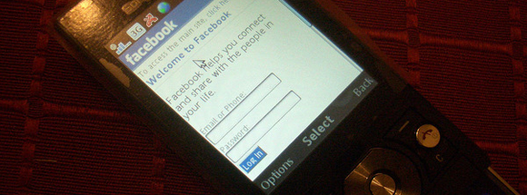
The best solution is to offer a link for changing back to the default site layout. In most applications this is placed at the very bottom of the page. Here it is out of harm’s way yet still in place for visitors to easily find the resource. Facebook and Digg are good examples of this.
A secret technique many web services implement is redirecting mobile devices to a sub-domain containing the alternative mobile version of the site layout. For example m.domain.com is a common trend seen among web 2.0 apps. This provides a few benefits, namely the ability to store configuration files in separate directories. This is a clean separation for removing a veil of confusion over how to structure web apps.

The era has only just begun as we start to see more consumers of mobile data and mobile phones. iPhone and Android sales are through the roof and show no signs of stopping. We can assume the amount of mobile Internet users will skyrocket over this holiday season with devices going on sale around the globe.
These tips are a great introduction into the mobile development environment. There are also many other mobile-friendly tools to check out if you’re interested in delving deeper. Trends will continue to fluctuate as the market changes but the core values of individual users will mostly stay the same. The truly successful webmasters will learn from this and scale their operations to fit their consumer base.
Comments
Post a Comment