We all know Google and Bing, and probably use one or both of them on more or less a daily basis. Search results are generally the defining factor that makes us have a good experience, and I suspect most of us don’t give too much consideration to the usability of the services.
However, with hundreds of millions of people using both of the services each and every day, even subtle changes in the usability of the two could add or shave off huge amounts of time for the two, and each small change can lead to a more enjoyable, more usable experience.
Today we will take a look at these two leviathans and see how they compare in terms of usability, and explain just what usability should mean to you. Want to learn how to improve conversions, get more subscribers, happier clients and better designs? Read on to find out how:
The testing process:
I have set up a quick test based on screenshots of both Google and Bing. There are just 7 questions in the test, and when you take it you will be directed to either the ‘Google’ channel, or the ‘Bing’ channel. This is a random process, and roughly 50% of people will be directed to each channel – this is to ensure a fair spread of users, habits and behaviours across the test.
To complete the test, you simply click on the location you think you would click to complete the assigned task. For example, if you were asked where do you enter your search term you would probably click in the search box; the testing application will generate a heatmap of where everyone has clicked, and you will have a quick visual guide of where people have been clicking. At the same time it will also record your average time to complete the task – obviously there is a big difference in completing a test in 5 seconds versus 10 seconds, and the results will reflect that.
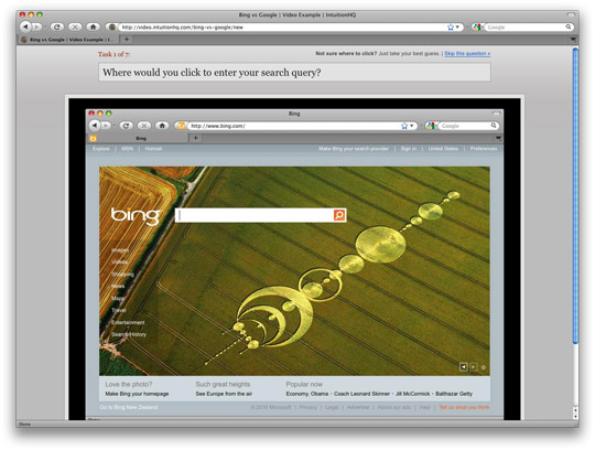
You can find the test at http://video.intuitionhq.com/bing-vs-google – as I said, there are just 7 questions, and it should take you 1-2 minutes to complete.
So, what does all this mean?
Having taken the test, we then need consider the questions, and the answers that we get from them. The questions were:
1) Where would you click to enter a search query?
- This is mainly a warm up question, and I suspect most people will be familiar enough with both of the interfaces that there should be very little difference in this task.
2) Where would you search for maps?
- The aim of this question is to see if people find the navigation menus are logically laid out. Some people have commented to me that they found the Bing navigation hard to read, while others have said they didn’t notice the Google navigation. This question should show up these issues.
3) How would you go to the New Zealand site?
- Local search is a huge earner in search, and getting to these local search sites is relatively important for both Google and Bing. I know which one is more obvious to me, but I’m curious to see what the results show.
4) Supposing you had email with this provider, where would you go to check it?
- Integrating services is another important point for both Google and Bing – they would like us to be tied into their who ecosystem. Email as a tool we use from day to day is a big part of this.
5) What part of the interface most attracts your attention?
- For both Bing and Google, search is the key service, and as such the search box should be the primary focus for both. These results should show us if it holds true for these providers.
6) How would you advertise with this provider?
- Advertising revenue is key to both of these businesses, so its key for advertisers to be able to find further information about advertising. Which one do you think will be better?
7) Where would you sign in?
- You can register for an account with both services, and logging in can customize your experience. Users who sign in are generally more committed to a service as there is a higher switching cost when they leave. The easier it is to sign in, the more likely people will do it.
Hopefully you can see why we asked these questions, and have some idea of the value of them. In our time testing we have seen people set up a wide range of different tests with different goals, and different information that they are trying to capture – just to give you some ideas:
- Where would you click to…
- Which layout is the most visually appealing
- Asking questions and giving a range of answers to choose from
- Comparing wireframes and current designs
- Testing layout sketches
- A/B testing on navigation layouts and wording
There are of course many more things you can do with usability testing than this, but hopefully this gives you a few ideas to get started.
The Results:
Now to have a quick look at the results. You can view them at http://video.intuitionhq.com/pub/405.
As more people take the test the results will be updated, and you might notice some changes, but the general results will be more or less the same.
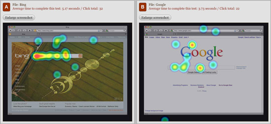
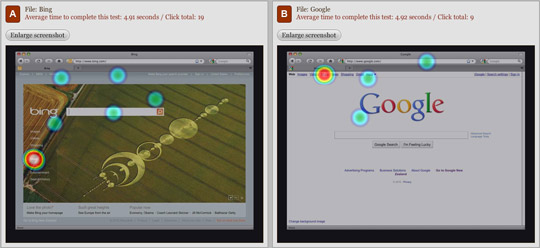
Google is quicker, but the clicks aren’t always in the right place. A win to Bing?
Bing 1 – Google 0
More or less a dead heat here. Both are very good.
Bing 2 – Google 1
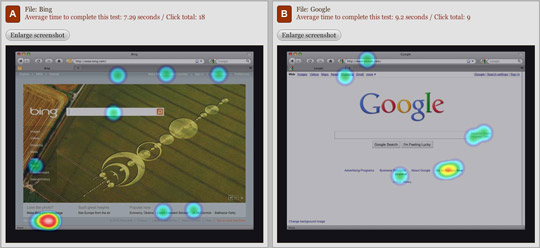
Bing is ahead here – 7.29 seconds vs 9.2 for Google. 2 seconds is a big difference.
Bing 3 – Google 1

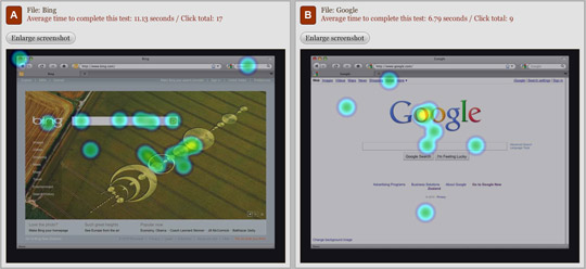
Google with a clear lead – 4.22 seconds difference between the two.
Bing 3 – Google 2
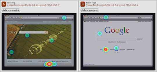
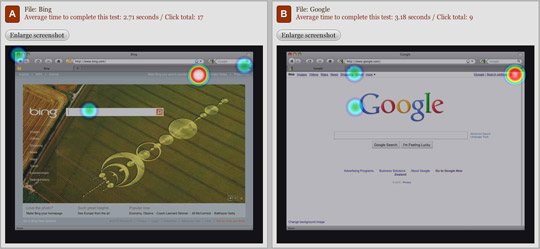
Seems Bings crop circles are very popular. Google is more focused on this one.
Bing 3 – Google 3
Google is faster by 1 second, similar success rates.
Bing 3 – Google 4
Stunning results for both (less than 4 seconds), Bing is marginally ahead but too close to call.
Bing 3 – Google 4
So based on the current results it’s really a very near run thing. I’m quite surprised to see this actually, evidently Bing’s UI is easier to navigate than I might have expected.
I think a lot of us have learnt behaviors for Google based on years of experience, so Bing is really doing well to stay up there with Google, especially considering the two UIs are quite far apart.
Both services could obviously make a few small tweaks to their UIs, but as you’d expect with two such popular websites, they are already very streamlined.
As more people take the test, we can expect to see results to evolve somewhat. Be sure to check back at http://video.intuitionhq.com/pub/405 to see how they change.
What Next?
Of course, usability testing doesn’t need to be solely the domain of large companies like Microsoft and Google, we could all do with making some tweaks to our own sites. Each improvement we make leads to people having a better, more enjoyable experience, and in turn means they are far more likely to come back to our site in the future, to subscribe or make purchase from our site or recommend it to others in the future.
As website designers, programmers and owners, these are the outcomes we are aiming for, and usability testing and usable design will help us get there.
So why not start out by testing your own site today, and working with your clients to improve their sites in the future. When we all focus on usability we can make the whole web a friendler, more enjoyable place to be.
Any questions about usability? What to know how to get started? Or comments on the article? Other sites you’d like us to compare? Please let us know in the comments! We’d love to share our views on usability.
Comments
Post a Comment