Mobile iOS devices have seen some tremendous growth over the 2010 period. With the growing sales of iPads and the popular release of the new iPhone 4 Apple has had an amazing year. Not only in these two markets but all iPod Touch devices are also running iOS which can access the App Store.
Here we’ll be going over brief ideas of how to design icons for iOS devices. There are many sizes and scales which require careful attention to detail and focus. iOS designers are required to submit an icon with their app into the store during publishing.
The process may be time consuming but the rewards are outstanding and provide a true sense of empowerment.
iOS App Development
The main process for designing an app for iOS requires two bits. The frontend design concept requires a branding or icon design to fit in the Apple App Store. Designers are also required to craft UI wireframe concepts for each screen of the mobile app.
Developers then enter XCode and spend hours working with views and libraries to produce a fantastic final result. Combining the graphics and programming can produce amazing applications to stand the test of time.
Designers do not often consider how much work is put into development of a mobile application. The style is different with Android-powered devices where Google hosts an open platform for any and all to build on. The iOS App store is much more exclusive and also offers the greatest chance of reaping a small profit.
Graphics Split on iPhone/iPad
Each icon has a specific size which is used for a certain purpose. The large amount of devices currently running iOS means designers must be on their toes to incorporate a keen icon set with each mobile app.
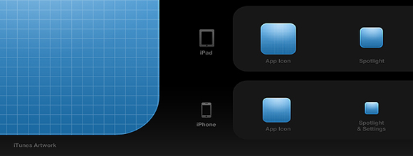
iPhone/iPod Icon Sizes
- Application Icon – 57x57px
- iPhone 4 icon – 114x114px
- App Store Icon – 512x512px
- Spotlight Search – 29x29px
- iPhone 4 Spotlight – 58x58px
The iPhone doesn’t have many icon size variations. The official app icon which rests on one of your users’ home screens is 57 pixels length and width. The iPhone 4 supports higher resolution settings so it’s optional to include a 114 pixel icon, though not required.
The largest size necessary of an icon is 512 x 512 pixels. This is a fairly large graphic which is displayed throughout the App Store and when browsing apps in Cover Mode. When opening Photoshop to design a new icon it’s always recommended to start at 512 and scale your way down.
Spotlight search supports slightly smaller sizes for icons. 29×29 may seem downright puny but when you’re viewing the search results screen it’s a fairly intuitive interface. The iPhone 4 similarly supports a Spotlight Search icon refined to 58 x 58 pixels for the higher resolution screens.
iPad Icon Sizes
- Application Icon – 72x72px
- App Store Icon – 512x512px
- Spotlight Search – 50x50px
- Settings Icon – 29x29px
The application icon is slightly larger this time around. The app store and cover flow sizes are still the same with an increase in our spotlight search dimensions. The iPad boasts a fairly large tablet touchscreen so icons can fit nicely.
The 29px version previous mentioned can be re-used for iPad as a settings icon. If you create a settings page within the iOS general functionality it will display a small icon next to your tab. This can be nice to allow users to change themes, include different accounts/usernames, and also fiddle with smaller options regarding your app.
Basic Icon Rules
The App Store only accepts applications which offer PNG files for icons. For many detailed reasons PNGs are able to hold deeper colors while not requiring much hard drive space.
You may also notice that icons from the app store have a gloss over their exterior. This is an effect added at runtime and shouldn’t be added into your actual icon. There is a Boolean switch which any app developer can use to turn the glossy icon effect on or off. However most icons benefit from the effect when done properly, so it’s best to leave this setting alone.
The iOS platform also applies rounded corners to icons in most screens. When designing your icon set be sure to keep all corners flat at 90 degrees for a perfect square. This is very important because Apple will add the rounded corner effects for your icons by default. If you apply this beforehand your graphics may publish improperly.
UI Tips & Design Kits
Icon designers should also shy away from using transparency in designs. This is reflected poorly when apps get published to the store since iOS has a difficult time rendering areas from an icon as transparent. If you’d like some inspiration check out our best iPhone apps for web designers.

There are also many resources available to app designers today. Icon artists are fairly open about sharing their projects and love helping the design community with their contribution. Browse the many UI kits for iPhone and iPad development which are free of charge and easy to download.
This has been a developed overview for starting iOS icon design. The process will require months of hard work and dedicated practice to master such an art. However the skills and production value of iPhone apps is tremendous and surely icon design is a skill worth acquiring.
Heya i'm for the first time here. I came across this board and I find It truly useful & it helped me out much. I hope to give something back and aid others like you aided me.
ReplyDeleteAlso visit my web page - Cccamserver