Landing pages for product sales can be seen everywhere. Affiliate marketers are constantly examining some of the newer techniques to mastering digital e-commerce. When the situation involves just a small market segment, the rules for landing page design can change.
Overall it takes a strong designer’s eye to create something extraordinary. Product landing pages offer fantastic insight towards deeper psychological marketing techniques. Here we’ll look into some great strategies for a sales page and what you can do to entice more sales.
Distinct Headlines and Ad Copy
Society has almost become numb to the classic ad copy sales pitch. After a while the general consensus of Internet users will shift and a broader understanding of marketing can be shared. In this regard it’s important to consider some of the creative opportunity in ad copy.

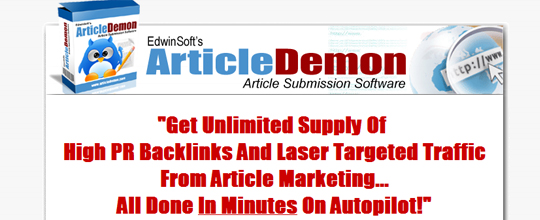
For example EdwinSoft’s Article Demon offers an interesting take on a squeeze page. The header offers some graphics which pertain to the brand and describe what you can expect. The large, bold red text is used to attract your attention immediately, and also entice you to scroll down further to learn more.
The ad copy throughout the page is also very well written. As you can imagine the writing process takes a long time and can be grueling. Just keep your message clear and to the point, there’s no reason to add convoluted language and it’ll either confuse or annoy your visitors. Also be sure to bold and underline your essential messages to help them stand out.
Include Relatable Media
Digital media can encompass quite a wide variety of information. The most common are including (but not limited to) audio recordings, podcasts, video presentations, or infographics explaining the growth process or benefit from your product.
When it comes to direct page images it takes a special craft to define them just right. Stock imagery in the category of businesses or modern people don’t often perform very well. The reason being they don’t present any underlying message or explain what your product does, or even why it’s useful.

The purpose of a landing page is to present a product or group of products and provide as much information as required to hook a sale. This means each area of page space should be utilized to its fullest in presenting your message. For software or template development it’s much easier to work in page graphics. However, when it comes to smaller products (for example e-books) you would need to create much of the design and branding personally.
It isn’t always worth the money to hire a professional, but when it comes to selling anything branding is important factor number 1. You should consider what type of message you’re sending out with your product and how you want visitors to feel when coming onto your page. Illustrations and icons are useful in both filling empty space and giving your page a pleasing look.
Keep Action Above the Fold
Anything that’s truly crucial to your sale should be introduced right away. Visitors can be finicky with their time and shouldn’t be expected to scroll down to find the information they need. In fact many studies have shown visitors will leave your page within the first few seconds if the actions seem too confusing.

By this it’s meant to say visitors are looking for something to do on your website. If they can’t find anything interesting to read, watch, listen to or interact with they will probably leave just as quickly as they came.
This is why offering a plan of action is so crucial. Visitors interested in your product will likely be excited to offer you their e-mail address for updates. Placing just a small signup form towards the heading on your page will spur dramatic interest and lead to increased sales in the long term.
Consider also working your brand into social networking opportunities. The chance to build a large network of followers is possible on major hubs such as Twitter, Facebook, MySpace, or YouTube. Once you have profile links created you can share them with those who land on your page. Popular execution methods can involve social media icons and small marketing campaigns to increase your profile activity.
Working with Colors
In both digital and physical design, color choice is everything. Colors invoke a set mood into those perceiving a piece of art, and a landing page website is no different.
Your choice of colors will vary based on your end goals. Black and green offer simulations of power and wealth. Green is also one of the easiest colors for the eye to process. By this reason it’s used by many popular financial institutions and eco-friendly corporations.
Blues create a sense of security and trust. It can be seen as the most common and professional color. Purples can be calm, soothing, often referencing beauty or glamor products. Similarly red can be used to produce an energetic sensation, leading to more visitor interaction.

Yellows and oranges behave similarly to bright colors such as red, but can be toned down and not so vibrant. Yellows appeal to youthfulness and grab attention quickly. Orange in a similar manner can be placed towards a call-to-action button for grabbing the visitor’s attention.
All of these are situational and should be used with precision. These tips are great for getting the initial juices flowing in designing a product page. Carefully created user interface elements will also surely draw attention to your finer points.
Always keep in mind the end goal of your process. Sales should be figured into the starting plan and tested thoroughly through refined analytics tools. Consider other landing page designs for inspiration on your own. There are many techniques available and you can learn a lot by networking with other Internet marketers and digital artists.
Comments
Post a Comment