The hot topic in design news is all about usability. Developers must concern themselves with properly functioning interfaces and applications via the web. However as designers we must tackle projects from a different angle, trying to design beautiful webpages which also run smoothly from a user’s standpoint.
It’s not to say these ideas haven’t been around over the past few years. It just so happens that recently the web has undergone a paradigm shift and we’re entering a powerful new information era.
This adds the values of user experience into the creative process and as designers we must keep up with the trends. I’ll be going over a few tips for how to do this and show how simple it is to integrate usability into your design.
Begin by Envisioning your Website Wireframe
This is the first step during the creative process and also the most energy-consuming. Creating a beautiful design out of thought alone can seem like a difficult task. However a shift in your perception of design may help move the creative process forward.
Sketching out a basic wireframe is the easiest way to tackle any design project. Initially starting in software such as Adobe Photoshop or Fireworks limits much of what you can or can’t do. Old fashioned pen & paper have never limited anything. The only limits you face are the edges of your creative mind!
Considering usability, you may start out by listing elements you want to see on the page once it loads (above the fold). These could include a main navigation menu, search bar, blog categories, contact information… truthfully any number of items. Keep the list small and scaled since there’s only so much room.
From here it’s much simpler to draft up a webpage mockup since you know what you’re aiming for. You may also consider showing your mockup draft(s) to others and getting a few opinions on the design. Gaining an outside perspective is always helpful as it is your goal to create fluid, accessible layouts for your visitors.
Implement a Plan for Mobile Design
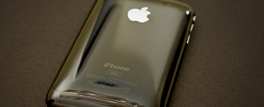
This idea would have seemed a bit far-fetched just a few years ago but we’re in a booming era for mobile development. Between the iPhone, Blackberry, and now Android powered devices it seems these days everybody is running a smartphone in their pocket.
Designers have already begun using this to their advantage by planning ahead. Mobile stylesheets are becoming the norm for most popular web applications. And with a bit of simple JavaScript you can easily catch what browser your visitors are using and apply any style accordingly.
A really useful tool for mobile design is Mobify Studio. They develop JS libraries which check to see if your visitors are running a mobile browser and redirect the stylesheet accordingly. They offer paid plans containing analytics and other powerful features, but for the basic user you can sign up free and still benefit from everything their scripts offer.
Structure your Typography Carefully
Typography is another whole can of worms included in the subset of design. You don’t need to master creating your own font or how to display individual custom letters in digital text. However as a designer holding a basic understanding of typography with usability tactics can work wonders.

A poisonous myth passed around the design community is how great smaller font sizes are. Arial set to 11px may look clean and professional but it’s awful when it comes to user experience. Setting your paragraphs to a more-than-readable size is highly recommended, especially with mobile users growing.
Be sure to add plenty of breathing room between your page content as well. Nobody wants to try and read 15 paragraphs of tightly bunched-up text split by a few headings. The CSS line-height property is a very useful yet under-utilized setting. This property sets how much space is placed between each line in a paragraph or in headings and other typographic elements.
When you get into developing page styles with CSS the workload is much simpler. By this I mean it’s much simpler to change a numerical value in your CSS compared to editing an entire PSD document. Try messing around with different values of line-height to see which works best for your design.
Headings must be Brash, Bold, and Beautiful
Don’t let your page headers fall to pieces within your design. Most visitors will come to your blog or website just to skim content, so your headings may be the only elements they read.
A distinguishable change could be in font color or differing typography (from sans-serif or serif, and vice-versa). Heading elements are set by default to appear much larger and bolder than text content. This helps readers get through content easier and pinpoint defined markers in your writing.
You could consider removing the bold weight and mess around with other properties. Italics, underlines, borders, and letter spacing are all fun to play with and see how they fit. Although depending on your design a straight underline could be easily confused with a hyperlink, so use creative judgement here.
Testing, testing, testing!
The area where many designers fail to show improvement is with the final stage in the creative process. Once you’ve completed a design and you feel comfortable with the outcome it’s easy to pass it along and move on.
This is where attention to details may fall apart as you could miss crucial errors in design judgement. Always test your website in as many different environments as possible. Modern operating systems can run numerous browsers. And with tools like IETester it’s never been easier to run tests for compatibility across the board.
Internet users are growing more impatient and spending less time visiting individual pages. Any traffic you do reel in should feel warm, welcome, and at home with no confusion or frustration interacting with your design.
Usability is still a new term for our growing web and it’ll surely be a hot topic in design conferences around the world. These tips are a great starting point but shouldn’t mark the end of your studies. Keep an open eye for new articles and advancements in user interfaces as these are the true elements of web design.
Comments
Post a Comment