There are so many techniques when it comes to web design, it’s hard to get a full grasp on all of them. Minimalism is one of the few which stand out from the crowd in a seemingly ubiquitous flow. The trend follows the concept of keeping things simple and easy to work with.
Removing clutter from pages helps users focus their attention on the things that really matter. Page content, images, contact information, and the presentation hierarchy that removes gradients and web 2.0 distractions. Check out a few of the ideas below in regards to minimalistic designs and see how you can incorporate these into your own projects.
How Does Minimalism Work?
The idea of minimalism in designs is not a new one. In fact, it’s been present in the art community for centuries. With the move into digital design we find things to be a bit different as the objects we’re designing are constantly changing.
Minimalism works by playing on your visitors keen attention, or rather lack thereof. Most visitors who visit your blog or website will not spend more than a few seconds on the page, maybe a few minutes if you’re lucky. This isn’t because they truly don’t care or hold apathetic viewpoints towards your content. Rather in our world of fast-paced action users know how easy it is to jump from one website to the next in almost an instant.
Playing on these pieces to your users attention span by placing content is easy to read layouts is the basis behind which minimalistic designs are built. You will frequently see much more typography and white space with fewer images and buttons as distractions.
Although there isn’t any guidebook for running minimalistic designs there are plenty of guidelines to follow. Additional white space is one such idea, along with the removal of unnecessary page elements.
Less is More – Adding Space for Readability
Designs where “less is more” often don’t turn out too good. Most commonly you’ll see designs like this running blank white pages with black text and a logo – not exactly the most exciting website around.
When grasping the concept of minimalism you have to understand how white space ties into your content. All that additional padding and space where there isn’t anything to look at – that’s called white space. It gives the reader’s eyes a break from so much content and helps them skim through text a lot easier.
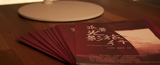
A good way to envision this is to consider a common textbook, maybe one from your favorite History course in high school. Generally these will contain large blocks of text with images and diagrams placed every so often. These are good examples of layouts with almost no white space (and they’re pretty hard to read, go figure).
One of my favorite blogs is written by Fred Wilson at http://www.avc.com/. His design is one such example of utilizing white space to enhance the appearance of text on a page. Although I wouldn’t label his blog theme as entirely minimalistic it does hold attributes of proper padding and white space, all key properties of minimalistic designs.
Elements of Simplistic Typography
Digital text is truly the most important aspect of any website. Unless you’re running a video or photo-viewing application the reason you have visitors to your page is to read content, so that content had better be presentable.
From a minimalists view of things content should be the main focus. This means all of these flashy newsletter signup boxes and live Twitter feeds are just distractions from what visitors really want. These elements aren’t totally bad or should be thrown out the window. They just don’t hold a place in true designs based on the concepts minimalism.
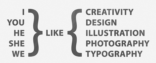
The two main elements when it comes to typography are headers and paragraph text. They both require plenty of white spacing as mentioned above, but they also need to stand out to your readers. Adding margins to your headers will visually separate them from the rest of your text. Contextually you may consider adding different properties to your headers such as italics, underlines, resizing or recoloring, too.
Paragraphs will generally stand out on their own as large blocks of text. You can make them easier to read by increasing font size and adding more space between lines (known as line-height). Keep your font colors much darker than your background but not so dark they contain deep contrast and hurt your eyes when skimming. Mess around with color choices to find the perfect in-between before moving on.
Keep your Layouts Unique
The truly exciting principle which keeps minimalism alive and thriving is how unique layouts can be. When all you (as the designer) have to worry about is context you are free to move things around at will. No longer are you stuck to a rut of 2 or 3 column layouts. You can break out of the mundane and really show off some creativity!
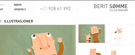
This doesn’t imply you can just throw elements together and come out with a beautiful design; far from it. We can consider as an example the portfolio of Berit Somme, an illustrator based out of Norway. His design boasts a powerful header and footer area with central content containing his digital works on display. All of the basic webpage elements are still there in one form or another, but it’s how they are applied in a creative way that truly makes the design.
When looking back on these styles there are only a few things to consider. Ensuring your goals have been met is a big one. Page content should also be easy to read and easy to skim through. There are plenty of showcases for minimalism to be found all around the web. These can be very helpful when looking for inspiration to get started.
It’s a truly diverse world out there as the field of web design advances into the future. Consider the ideals of a minimalistic viewpoint when starting your next web design, even if you don’t plan to go all-out. Many of the concepts held within minimalism can be applied to all website projects to relieve clutter and clarify the purpose of your design.
Comments
Post a Comment