User Experience Designers usually aim to make application interfaces intuitive and easy to use without relying on help or a manual to guide the user through how to use the app. However, there are times when an interface is most effective and efficient to use once some initial behaviors are learned. In these cases, designing an application to be completely intuitive upon first-time use can be impractical or detrimental to repetitive use. There are also times where a quick introduction on how to use an app simply makes the user feel more comfortable interacting with it for the first time, and is not a reflection of a poorly designed interface.
iPhone applications that introduce new, innovative interaction models or that allow the user to access a wide range of information or complete several tasks often use first-time use help screens to help users learn how an app works. This help can come in a wide variety of styles: demos, tutorials, single screen overlays, walkthroughs, tips, or short screen summaries. These first-time help screens are often supplemented by a centralized help or FAQ area within the app. Below is a look at how different apps have leveraged these help patterns to introduce functionality to their users upon first use.
1. Demos
A demo animates a series of screens showing the primary functions of the application. This can come in the form of an animated walkthrough in which key interface elements are called out within each screen, or in the form of a short (up to 30 seconds) video demonstrating functionality.
Examples:
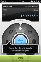
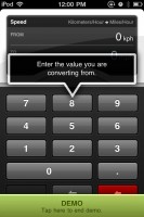
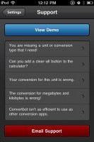
- Convertbot: Convertbot is a unit conversion tool. Upon first launching the app, it asks the user up-front if they’d like to view a demo of how it works, then uses an animated demo along with bubble callouts to demonstrate the end-to-end action of converting something within the app. This demo is also accessible under the “Support” screen in the app, allowing the user to view it at a later time.
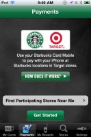
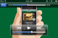
- Starbucks Mobile Card: Starbucks’ mobile payment system, Mobile Card, provides a demo upon entering the “Payments” tab. The demo is in the form of a 30 second video that demonstrates actions that occur within the app and within the Starbucks store itself.
Considerations:
- Always allow the user to end the demo if they’re not interested in viewing it right away.
- If shown only at first launch, provide access to the demo somewhere else for later viewing.
- Keep it short – no longer than 30 seconds.
- Annotate interface elements that require additional explanation.
Pros:
- Demonstrates key aspects of the app without having to tap through multiple screens.
- Helps to show the relationships between elements in the app.
- Can incorporate branding messaging to help set the tone for the application.
- Can show both online and offline actions that relate to use of the app.
Cons:
- May demonstrate too much functionality up-front as opposed to in-context.
- If play controls are not used, the user cannot easily replay sections of the demo.
2. Tutorials
Tutorials allow the user to tap, scroll, and/or swipe through static images of the application that point out key interface elements and interactions.
Examples:
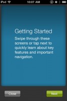
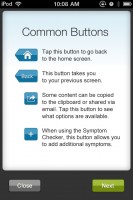
- WebMD: First time use shows an alert box with the option to view a quick tour of the app. The tour allows you to tap a “Next” button or swipe to advance screens. The tour uses an extensive 15 screen tutorial to point outs controls and information throughout the app.
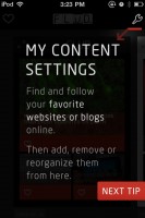
- FLUD: This news aggregator introduces the application by reinforcing the primary purpose of the app, and follows with a very brief tutorial that introduces two key functions of the app. The tutorial ends by marketing a supporting iPad app, showing that first-time tutorials can also be used to encourage further engagement.
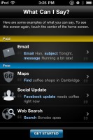
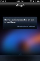
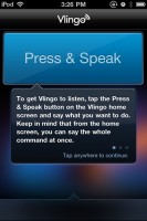
- Vlingo: Vlingo is a voice app that turns words into actions. The first screen displays a centralized help area, which also accessible within the app. Tapping on a section provides detailed help regarding each aspect of the app. Tapping on “Get Started” starts a quick tutorial of the app, where the user taps on the screen to progress from screen to screen.
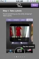
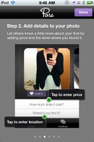
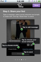
- Pose: Pose allows users to add products to a personal style feed and share and discuss their finds. The first screen reinforces the primary purpose of the application, then allows the user to swipe to reveal a multi-step process to complete the primary action within the app. Each screen uses annotations to explain interactions that can occur during each step in the process.
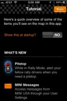
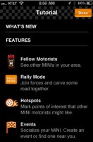
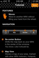
- MINI Link: This app allows MINI car owners to detect and connect with other MINI owners. A scrollable tutorial pops up on startup including “What’s New”, “Features”, and “Navigation” overview sections. The tutorial gives the user the ability to show the content upon each startup. If turned off, the tutorial is still accessible via the main screen of the app.
Considerations:
- Tutorials can be used to either introduce all aspects of an app or focus on key interactions.
- Try to reduce the number of tutorial screens used (10+ is likely too much to digest all at once).
- Allow access to the tutorial in a permanent section of the app for later viewing.
- Allow the user to bypass the tutorial on first-visit.
Pros:
- Allows the user to follow the tutorial at their own pace.
- Can introduce more than one feature at once and describe the relationships between areas of the application.
Cons:
- May demonstrate too much functionality up-front as opposed to in-context.
3. Single Screen Overlays
Single screen overlays serve to point out key interface elements in context of viewing a specific screen. The overlay is typically used to explain the use of 1-5 controls in a way that is quickly read and then dismissed.
Example:
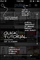
- Pulse News Mini: This news aggregator uses consistent controls and actions throughout the app. A screen overlay introduces these actions in a simple, easy to understand manner.
Considerations:
- Due to limited screen space, explanations must be kept as short and succinct as possible.
- Overlays are best used where primary user actions occur within a contained interface that keeps controls consistent across all screens in the application.
- However, single screen overlays do not necessarily have to appear only for the first screen the user sees in the application. They can also appear upon first view of deeper screens that utilize a different set of controls.
- Make it obvious how to dismiss the overlay screen. This is typically accomplished by tapping anywhere on the screen, but could also be accomplished with a “Close” or “Done” button.
- Since the screen may be dismissed either accidentally or purposefully without the user reading everything, provide a way of accessing the help information elsewhere in the application.
Pros:
- Explains interface elements in context of a user interaction as opposed to explaining everything across multiple screens upon first use of the application.
- Emphasizes the primary user actions that can be taken without overwhelming the user.
- Helps to introduce controls that may not be standard among other iPhone applications without making the user learn their function through trial and error.
Cons:
- May not be appropriate for interfaces that have many controls that require explanation.
- Only describes functions on a single screen as opposed to how processes or actions work across multiple screens in the application.
4. Walkthroughs
Walkthroughs help users learn actions used throughout an application by guiding users to complete a task step-by-step. Walkthroughs help users accomplish a task quickly. By doing so, walkthroughs encourage additional application use and exploration.
Examples:
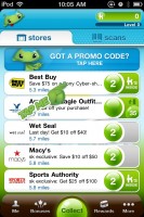
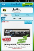
- Shopkick: Shopkick offers deals and rewards for using the app in various businesses in the United States. Upon opening the app, animated “Tap Me” imagery points out what action to take in the app. For completing the action, the user is rewarded with points. After completing the first action, a second instruction is given on the next screen in the application.
Considerations:
- Walkthroughs are best used in apps that have one or two top tasks that are able to be completed in a small number of steps.
- You should explain the overall goal of the actions before guiding users step-by-step through a task, so that users can better connect the actions they take to the end result.
- Consider ways of making a walkthrough fun and rewarding, such as awarding points or status for completing the requested action.
- At the end of the walkthrough, clearly guide users toward what they should do next, or return the user back to the first screen in the application.
Pros:
- Can help introduce top tasks and processes in a quick, fun way.
- Helps the user learn key behaviors by doing the actions themselves, as opposed to by looking at images or words.
- Walkthroughs build upon the idea of sequencing, meaning that we are more likely to take action when complex activities are broken down to smaller tasks (as described in Stephen Anderson’s Mental Notes). By accomplishing a small task quickly, the app can feel less complex.
Cons:
- May prevent the user from exploring the app in a way most suitable for their own needs upon first use.
- A walkthrough may become overwhelming if a task takes more than just a few steps to complete, and could make the app seem complicated.
- Since walkthroughs tend to only focus on one isolated action, it may take longer for users to get acclimated to the full range of interactions available in the application.
5. Tips
Tips provide the user with descriptions of functions within an application. Tips are generally displayed one at a time, with the ability to optionally view additional tips. Tips can appear either appear immediately upon launch, or appear upon the user actively opening a tips screen or overlay.
Examples:
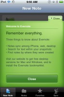
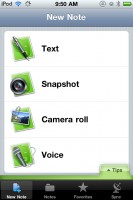
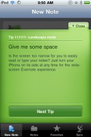
- Evernote: Evernote synchronizes notes, snapshots, and voice recordings across multiple devices. Upon the first time launching the app, a welcome screen pops up with the top three things to know about the app. After closing the welcome screen, a “Tips” tab appears at the bottom of the screen. Tapping on “Tips” pops up a single tip with the ability to click to view additional tips.
Considerations:
- Tips are mainly suitable to introduce lesser-known features within your application. They tend to take a “Did you know…?” approach, which lends itself more to discovery of features rather than learning key functionality.
- Always provide a way of disabling or minimizing tips upon startup so that they do not annoy or inconvenience the user.
- Tips tend to be random upon launch, with the ability to progress through all available tips with a “Next” button.
Pros:
- Quick, easily digestible pieces of information are a good way of introducing features or actions without overwhelming the user.
- The idea of a short “tip” is less daunting than going through in-depth instruction in order to learn about the application.
Cons:
- Not as comprehensive as a tutorial or demo, and therefore may not help clarify actions that require multiple steps.
- May appear out of context upon first use of the application. Most users need to feel comfortable with the app’s primary functionality before learning some of the detailed features that tips introduce.
6. Single Screen Summaries
Single screen summaries are a very basic way of introducing what you can do on each of the app’s primary screens. An overlay containing a very short amount of text appears for a couple of seconds that describes what the screen represents. This overlay is typically only displayed once upon first visit to the screen and does not return upon subsequent visits.
Examples:
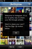
- Instagram: Instagram is a way of taking and sharing photos using your iPhone. First use of the app provides guidance towards the primary call to action, which is to sign up for the service. First visits to each tab bar icon pops up a short summary of the screen at the bottom of the screen that disappears after a couple of seconds.
Considerations:
- Display the screen summary long enough so that it is able to be read completely before disappearing, generally at least 5 seconds.
- Keep the length of screen summaries to one sentence long.
- Display the screen summary in context of the screen’s content to tie together the message of the summary with what is on the screen.
Pros:
- Allows for quick clarification of the primary purpose of key screens in an application.
- Acts as an unobtrusive way of providing information without detracting from the user’s own exploration.
Cons:
- The amount of instruction that can be displayed using this method is very limited.
- If the summaries only appear upon first view of a screen, they may get missed without an easy way of retrieving the instruction.
As you can see, there are a wide variety of methods of helping your users learn key functions of your iPhone applications without detracting from the overall user experience. Have you seen any other patterns used to introduce application functionality to users upon the first time launching an app? If so, share them in the comments!











Monitoring also allows you to be on the loop as to what potential customers want.
ReplyDeleteSEO Book's Rank Checker won the popularity as one of the fastest and the most precise rank checkers. You could buy the best software from software vendors or from a leading retailer.
Feel free to visit my blog post : seo link robot software