There is a thin line between design and development, and as we move into a new decade, this line is becoming extremely blurry. Is it enough to draw beautiful mock ups in Photoshop? Maybe 5 years ago. These days, the average internet user requires more. All beauty, with no substance, gets boring after a while. If your only goal is to impress a community of fellow designers with your flashy designs, you’ll find yourself quickly beneath the tide. 2011 is not about beauty, it’s about function. The trends for this new year and emerging decade are responsive design, constant connection and virtual reality.
How will you stay relevant as a designer in 2011? The ultimate goal of a designer is not to dazzle but to entangle. Any designer can get ‘oohs’ and ‘ahhs’ that are easily forgotten. The supreme designer is able to create an environment which charms and captivates the user to the point where he does not want to find the ‘Back’ button. Several elements come together to forge such a wonderland: harmonious color scheme, intuitive design, easily accessible information and fast response. Additionally, one can never under-estimate the power of simplicity. Of course, this has always been the case, but in 2011, you are no longer at the forgiving discretion of the desktop, or even laptop, computer. Now, your design must contend with smart phones, netbooks, tablets and the like. Are you ready?
Take a gander at the top 11 trends for 2011.
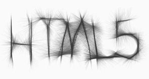
1. More CSS3 + HTML5
What a gratifying sigh of relief! CSS3 and HTML5 have been on the distant horizon of web design for the past couple of years, but now, in 2011, we see an explosion of it. Designers are finally starting to let go of Flash. However you may feel about Flash, you do know that it does not play well with some of the hot, new technology available to your current and potential visitors. In 2011, you will slowly step away from Flash and embrace the magic known as HTML5. Look at the amazingly similar comparison:
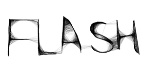
Now that’s shown, please understand that Flash and HTML5 are not equal opponents. There is plenty of room for both in 2011. The problem is that designers in 2010 (and before) misused Flash. Case in point, very rarely should your entire site be made of Flash, especially these days. HTML5 alleviates some of the burden we have placed on Flash. However, HTML5 cannot (yet) replace the extraordinary design elements we can achieve through Flash.
Perhaps even more exciting is the fact that CSS3 is available to us in a real way this year. Move over Photoshop (wow, Adobe just cannot rest), because CSS3 is making short work of text shadow, border radius and image transparency. If you have not already begun, now is the time to really delve into understanding CSS3 and HTML5.
2. Simple Color Schemes
Simplicity. There’s nothing quite as impacting as an honest message on a quiet backdrop. Quiet can be interpreted several different ways. Forget black and white or shades of gray. Think of green, yellow or even red as your primary color. However, limit your palette to two or three colors. Work within the shades of each color for variety. It can be truly remarkable what a few colors can do for your message. Observe:
Shades of green create this Twitter visualization tool. Side note: this site was created with XHTML/CSS and Javascript.
Red can be jarring if done incorrectly. This site gets it right by subduing the color’s overwhelming personality with easy-to-read high contrast text.
3. Mobile Ready
Smartphones, iPads, netbooks, oh my! There’s a dizzying amount of mobile products available to the consumer in 2011. This means your web design must be responsive to multiple viewports.
Creating a mobile ready website is not simply removing the bells and whistles from your design. This can create a vacant and impersonal design. Although not impossible, distilling the magic from your original design into a pure representation of your brand is tough! Fortunately, technology is quickly removing this burden.
With the help of CSS3, primarily media queries, mobile web design has taken a big leap forward (more on this later). One of the most important advances is that you can design a whole site and allow your coding to conform to the user’s viewing medium.
It may be tempting to just create a dedicated mobile site, but that may no longer satisfy your audience. Increasingly, mobile sites include the option to visit the original site. If you do not offer this option or if your original site is not optimized to mobile standards, you are simply not ready for 2011. Forecasters predict that smartphones will outsell personal computers this year. Bulletproof your design to meet this demand.
4. Parallax Scrolling
Parallax scrolling: not just for old school video games. As aforementioned, the hot web design trend for 2011 is creating a sense of depth. What better way to create that than with parallax scrolling? The parallax effect uses layers to present the illusion of a 3 dimensional space. It can be accomplished with some simple CSS tricks or the help of jQuery plugins like Spritely. Parallax scrolling can be most effective as a secondary element on your design, for example, as a header, footer, or background. Making it an integral part of your navigation may prove frustrating for your site visitor.
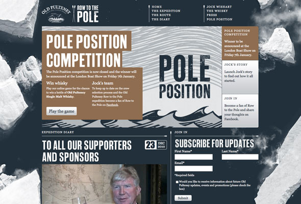
The Old Pulteney Row to the Pole website uses a top down parallax scrolling effect for the background. This adds a nice subtle amount of depth and lots of interest.
5. Designing for Touch Screens, Not Mice
Technology has become much more tactile. Usability is shifting from abstract to tangible. This means that instead of navigating your mouse to remotely connect, your destination is literally at your fingertips. Tablets, most smartphones and some desktops use touchscreens. Does your design accommodate fingertip navigation?
How much of your design is mouse-oriented? As designers, we worship mice. Our links light up when the mouse hovers over. However, there’s no hovering in touchscreen. How will your design indicate links to your visitors? What about drop-down menus? That’s also a no-go in touchscreen design.
Similarly, how will visitors peruse your site? As controversial as it may be for standard web browsing, horizontal scrolling may be more appropriate for touchscreens. Fitting nicely into this niche is a magazine-like layout where visitors virtually flip through your site.
Lastly, consider using liquid layouts as part of your commitment toward responsive design. In 2011, you are no longer dealing with screen resolution size. Visitors can change their viewing orientation from vertical to horizontal. Your design must be flexible to meet any challenge, or you will be a relic of 2010.

Baby sees the iPad Magic, Copyright Steve Paine, Flickr
6. Depth Perception in Web Design
No, we are not dealing with the aerial ‘I can see your coffee cup and keyboard on your website’ design of two years ago. Depth perception is about creating dimension in your web design, so that parts of your site looks nearer than others. It conjures a faux 3D effect when done masterfully. Remember what it felt like watching the blockbuster 3D movie, Avatar? The elements jumped off of the screen, quite literally.
Although 3D technology has no yet made it to web design, you can still replicate depth in your design.
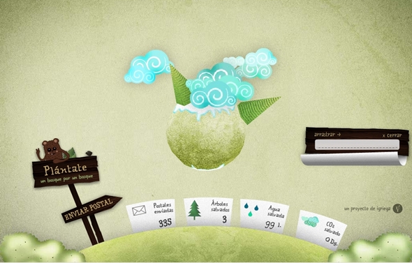
This playful website features a rotatable, 3D planet and makes use of depth with well-placed shadows and layering.
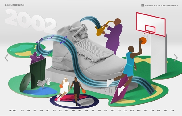
Eye-catching and smart, this celebration of Jordan (both the man and shoe) is thoroughly entertaining. The 3D elements are crisp and simple, which what makes them so stunning.
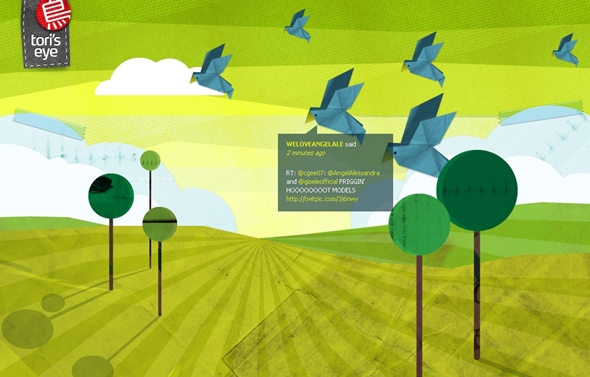
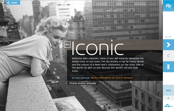
7. Large Photographic Backgrounds
Large scale backdrops will surge in 2011. These images will be high resolution, and covering the entire site. Large photos are an instant way to grab your audience– they cannot help but to see it and have an opinion about it. The background photo must be content-appropriate. Simply having a pretty image in the background without any context will disrupt your user’s experience. Trends point to soft and slightly transparent imagery that does not over shadow your content, but harmonizes with it.
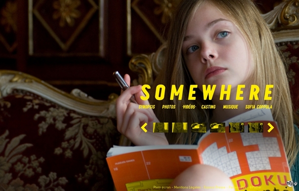
This site makes use of high-resolution photos and the predominant color is yellow throughout.
This site adds playful animation with its grand scale imagery. Warning: auto-play music.
8. Adventurous Domain Names & Integration
Although not in the strictest sense a web design issue, look forward to seeing more creative domain names. The once-coveted .com domain has lost a lot of its appeal– primarily because you have to think up words in Na’Vi in order to find a domain that has not been thought up yet. 2011 will see a more wide-spread venture away from .com and into more whimsical domains like .me or .us. Think of the possibilities and scoop it up before it’s gone.
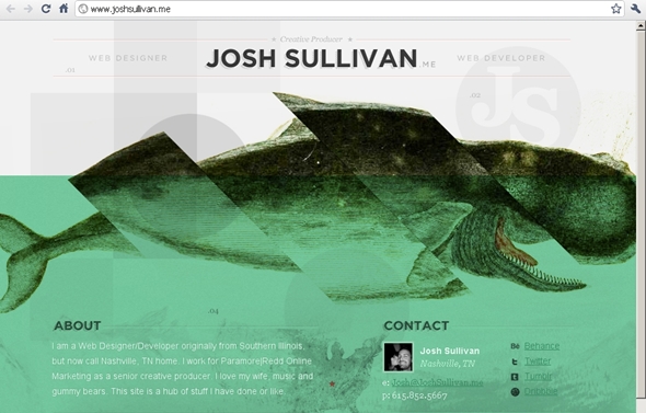
.me is a great domain to use for personal portfolios, or blogs, especially if you want a seperate identity from your corporate brand.
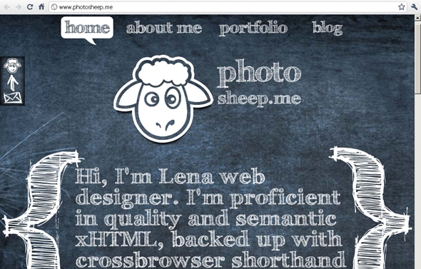
Another example of .me integration.
9. QR: Quick Response
If you have noticed those square barcodes popping on business cards, magazines or else where, you may already know that they are a hot trend for 2011. How exactly does it translate into web design? Amazingly well, in fact.
The barcodes are called QR, short for Quick Response. Simply take a photo of the unique barcode with your camera phone. Like magic, your phone will call up the website associated with said barcode. The beautiful thing about QR is that you can use it in a myriad of ways. Feature your QR on your website, in order for site visitors to have a shortcut to your mobile site. You can also track your visitors through QR, by placing a special referral code on your URL. When you are leaving comments on sites such as this, use the QR as your avatar.
2011 is all about mobility and it will be smart to take advantage of this new medium.
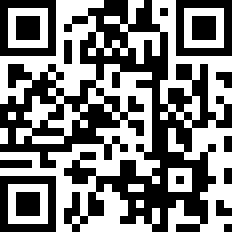
This is the QR for the author’s personal website. Create your own code here.
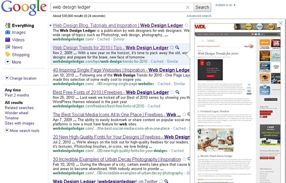
10. Thumbnail Design
The ever-enterprising folks at Google have introduced the average user to thumbnail browsing. Gone are the days of clicking through to see the content of a website. These days, you just click on the magnifying glass and hover (assuming you’re not on a touchscreen). Magically before you is a glimpse of what waits on the other side of your click.
If your design is Flash-based, that is definitely going to be a problem. The preview will not display those elements of your design.
As the average internet user becomes more surfing-savvy in 2011, expect to see more people navigating by these means. It is just too great of a temptation not to judge a site by its thumbnail.
11. Constant Connection/ Life Stream
Last, but certainly not least, is the focus on constant connection in web design. The internet is, by nature, a sterile environment, and we make it human by sharing our lives in an open forum. Expect to see more intimacy through the form of lifestreaming. Personal blogs and portfolios in 2011 will prominently feature live Twitter feeds (not just a link to the Twitter page). People will let you know where they are at any moment of the day via Foursquare. In fact, expect to see a dedicated lifestream for all of one’s online activity. 2011 will definitely bring out our inner, creepy stalker, no doubt about it.
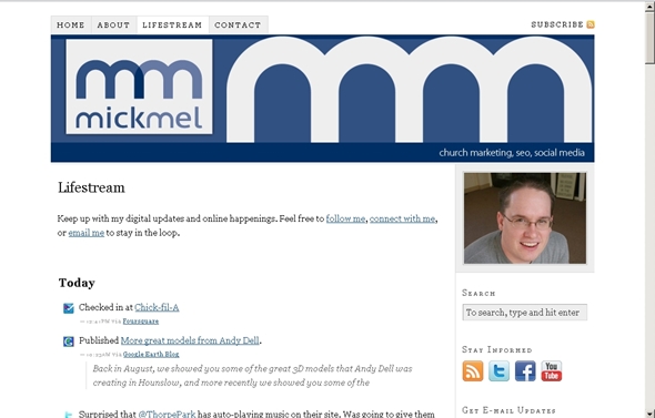
A personal site that utilizes lifestreaming.
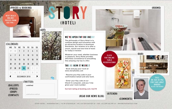
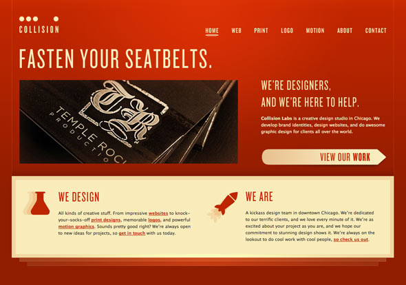
This is a business site that synthesizes a lot of information on one page.
It was a good post......
ReplyDeleteThe best option is to ask people you know who have good business websites for references
Website Design UK