The year is 1999. You’ve just watched the Matrix, and it’s blown your mind. You sit down in front of your computer to work on a web design and then create or download an animated Matrix background for your Geocities website. You’re so cool. Fast forward 10 years, and you say to yourself, yikes, what was I thinking?! We’ve all been there. As a matter of fact, I’m personally guilty of copying many of following trends.
Trend isn’t a bad word in web design. In fact, the items on this list inspired an entire generation of web designers. All of these ideas were so huge that they created a mass following. That’s a good thing. The problem comes when we’re happy to create a clone of a great design and let it rest at that. Great designers push themselves to be ahead of the trends, or they twist the trend into something uniquely their own. The problem isn’t that you were inspired by the Matrix, it is that you didn’t re-imagine your inspiration into something different. As you look through this list, remember the reasons why you may have once loved these web design trends. It will help you understand why they were so popular, and what you can learn from them.
Reflective Text or Objects
Mirrored objects are one of those web design trends that seem to constantly resurface. We love it for the sense of realism and dimension it brings to a static 2D image, but most of the time it’s done incorrectly. It takes more than simply flipping an object upside down to make a mirrored image.
Aqua Buttons
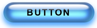
There’s no way this list could exist without the prominent mentioning of aqua buttons. These shiny, glassy, light blue buttons gave the impression of 3D even though they took less than 10 minutes to make in Photoshop. Amazingly simple, aqua buttons were a ubiquitous trend that finally died down around 2005.
Flourishes
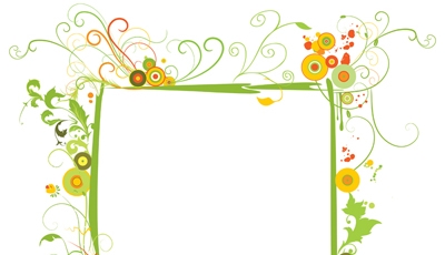
Unfortunately this web design trend is still in its 14th minute of fame. These embellishments are often created to emphasize an artsy site, and can be done very well, especially if the designer is particularly gifted in graphic art. The problem is that this look has been seen in an obscene amount of sites, and is no longer fresh or unexpected. The flowers are dying.
Desktop Design with Coffee Cup
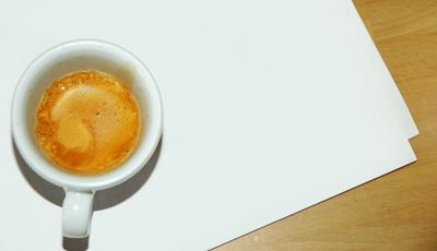
Don’t forget the coffee stains somewhere in the design. I’ve never quite understood the perspective on this design. Is the viewer supposed to be standing up and looking directly down at the desk? That’s the only way this view makes sense. This trend must be stopped.
Animated Globe
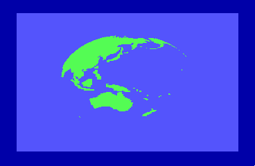
Fortunately, this web design trend has come to an end for most websites, but it died a long death. This popular “rotating” earth was usually attached to the site’s logo. Most businesses which displayed it weren’t even international. It was your local mom and pop shop showing they could have a fancy animated gif, too.
Comic Sans Font
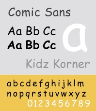
There was a time when Comic Sans was everywhere and, despite its name, it wasn’t funny. Comic Sans was the font many misguided designers used to convey a sense of playfulness on their websites. Comic Sans has stirred an unholy amount of hatred over the years, and yet it continues to exist as a font. Fortunately, every designer knows to steer clear of this font like the plague.
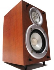
Overused Stock Images

How many business sites have we visited where there’s one of these images on the front page? Of course, clients request these types of stock images all the time, but as designers, we have to show them what else is possible.
Torn Notebook Paper
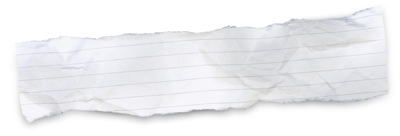
It’s nice to see realistic elements on websites, but the paper look lacks originality. The overwhelming amount of paper textures and tutorials make this a definite trend to avoid for a trend-setter.
Polaroids
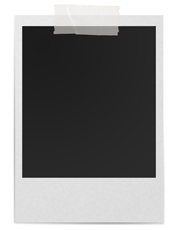
There was a time when everyone incorporated Polaroid-type objects into their design. This retro trend has outlived its usefulness. Polaroids may be a fun throwback, but it’s doubtful that anyone born after 1990 has ever seen one in person.
Oversized RSS or Twitter Icons

We get it. You want us to subscribe and follow your random thoughts. We want to, but putting up a huge RSS icon that’s half the size of your web page is just obnoxious and insults your visitors. The same goes for Twitter. Keep these icons classy and non-obtrusive.
Auto-played Music
Music is awesome, but it’s wrong to impose your music selection on your visitors. What if they’re listening to their own music? Unfortunately, there was a time on the internet when bored office workers had to surf on mute for fear that they may enter the wrong website. Fortunately, most designers have dropped this trend, but it still seems hot in Eastern Europe.
Counters
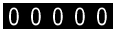
Here we have the sad web design phenomenon of visitor counters. In the early days of the internet, web designers used counters as a way to (sadly) collect visitor data, but more often to impress visitors with an impossibly large amount of web traffic. These counters were notoriously inaccurate and everyone knew it, because no one believed you had over a million visitors into your Homestead account. Fortunately, the web counter trend is dead, and happily so.
Marquees
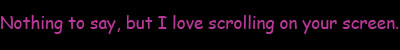
Scrolling text across any part of a website is considered a marquee. Marquees were so cool in the late 90s, but soon lost its seem once designers realized that websites are not headline news networks. We all seen way too many marquees in Comic Sans font.
Frames
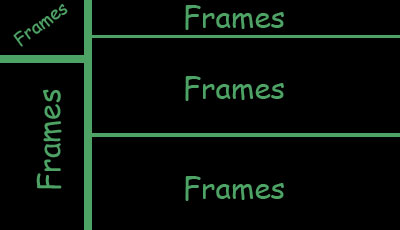
Frames. Frames are probably the saddest trend on this list. The only thing that saved us from frames was the supreme importance of the search engine. Designers started realizing that it was no longer optimal to have five or six pages to incorporate one home page. Frames were ugly, difficult to deal with, and had way too many moving parts.
Splash Pages That Make You Choose
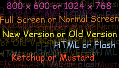
Flash or HTML? Old site or new site? Full screen or normal screen? Your visitor does not need to face these crucial choices before entering into your website. This trend is still popular amongst designers who don’t realize how to effectively manage both old and new, html and Flash. By the way, no one likes full screen. Keep it simple. Don’t give your audience these types of choices or they may choose to leave.
Intro with No Skipping Option
This design trend forced visitors to sit through an impossibly long (no matter the length) introduction to your site with no means of escape. The trend supposed that every visitor to your site was a first-time one, and never took into account the possibly of repeat visitors.
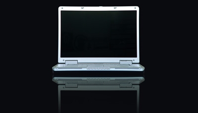
Black Backgrounds
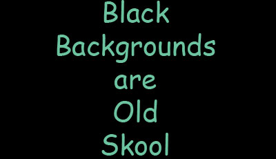
This is a delicate subject, but black backgrounds are an overused trend. Dark is nice, especially if you find surprising new colors to re-interpret a mood such as a deep blue or a hazy gray, but black is out.
What do you think this list is missing? We’d like to hear from you.
Source http://webdesignledger.com
Comments
Post a Comment