There are a number of elements that make up a great web design, but probably one of the most overlooked and underutilized is whitespace. Every design has whitespace, but the problem is that not every design has enough. This could be due to the fact that inexperienced designers and their clients see whitespace as empty space and therefore a waste of valuable screen real estate. The truth is, whitespace might be one of the most valuable parts of your design.
What is Whitespace?
Even though its name seems to suggest otherwise, whitespace doesn’t actually have to be white. It gets its name from the early days of graphic design where most printing was done on white paper. Whitespace is simply the empty space between and around the elements of a design or page layout. This can include: space around graphics and images, margins and gutters, space between columns, and even the space between lines of type. Whitespace is also referred to as “negative space”.
Whitespace is made of nothing, but shouldn’t be treated that way. There are several benefits that a generous dose of whitespace can bring to a design. Simply by increasing the space between elements in a layout, a design can take on a more elegant appearance, and by injecting more whitespace into a web design’s typography, content becomes more legible.
Elegance and Sophistication
In print design, paper is a valuable resource and clients will usually want you to use every square inch of it. After all, it costs them money and they want to get their money’s worth. Similar value is placed on screen real estate in web design. They both have set dimensions and represent limited space in which a message can be presented by displaying text and graphics. This is why being generous with your whitespace will speak volumes about your brand. By using large amounts of it, you’re saying that your content is far more important than the screen real estate that it rests on, and you can afford to sacrifice that space in order to better present your message.
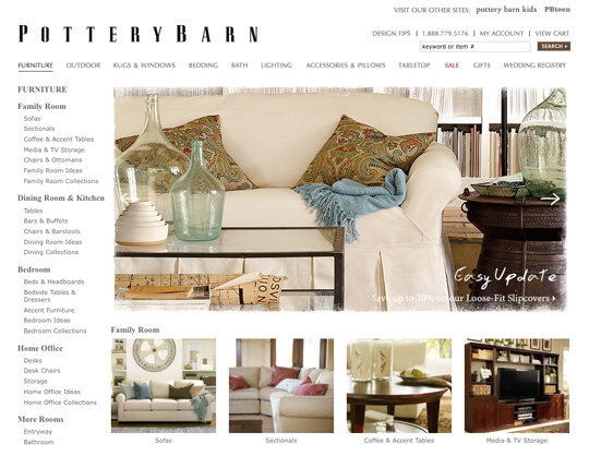
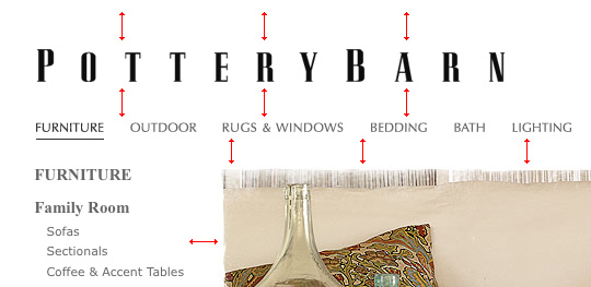
Luxury brands use this concept to convey an image of sophistication and elegance. Let’s take these two furniture companies for example. Pottery Barn, being the more upscale of the two, uses lots of white space between the various elements. Notice even the logo uses large amounts of whitespace between each character.
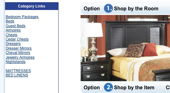
Rooms To Go, on the other hand, is a lower end furniture store and it shows in their web design. There are several factors that contribute to this, and a lack of whitespace plays a major role. With so little space between elements, I won’t even attempt to insert the little red arrows.
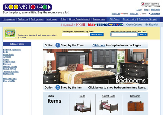
Notice how the list of category links is crammed up against the left border. Things like this can make a design look sloppy and unprofessional.
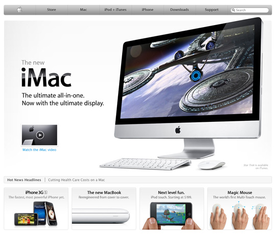
Lets’s take a look at two other brands that you will probably recognize. Below is a comparison of the Apple home page and the Microsoft home page. You will notice that Apple, being the epitome of elegance and sophistication, uses plenty of whitespace. While the layout of the Microsoft home page is a bit more crowded, resulting in a not-so-elegant feel. This is right in line with each company’s general brand perceptions.

Better Legibility and Usability
On a micro level, whitespace plays a major role in typography and even usability. Text that is cramped with minimal line spacing can be very difficult to read. By adding more whitespace between lines of text, content becomes easier to scan and digest.
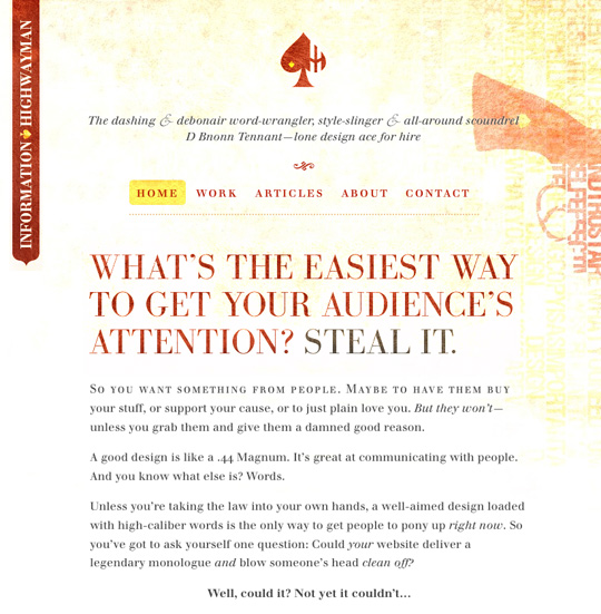
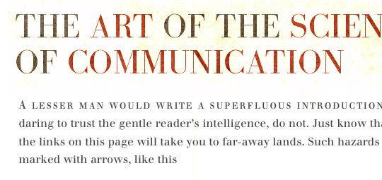
Information Highwayman is the portfolio of D Bnonn Tennant, and it’s an excellent example of great use of whitespace within text. The large amount of spacing between lines makes the content a joy to read.
Micro whitespace not only makes text easier to read, but also helps separate blocks of content from one another. This can help a user differentiate where content starts and stops.
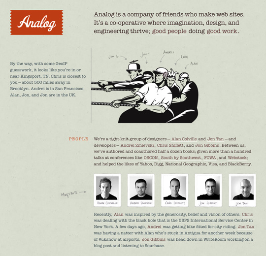
Analog is a single page website. So it’s important to create enough separation between the various blocks of content so that they stand out from one another. Here, the Analog team uses varying amounts to create separation and flow within the content. A larger amount of whitespace is used to separate the content blocks, then a smaller amount is used between the paragraphs within each block.
Develop an Eye for Whitespace
Like so many other aspects of design, there is no set guidelines or rules for calculating the right amount of whitespace. All designs are different so the amount you use will vary from project to project. The best way to learn is experiment and study the work of other designs that seem to be getting it right. Eventually you will develop an eye and feel for what is the right amount of whitespace.
Source http://webdesignledger.com
Comments
Post a Comment